What is the load-duration curve?
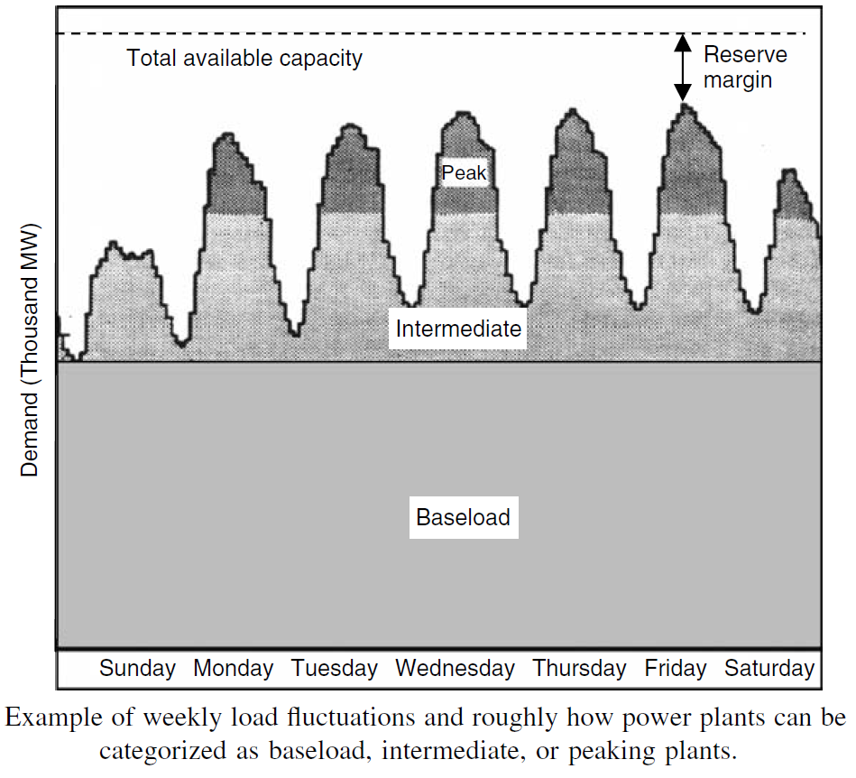
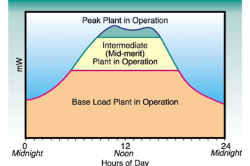
Figure 1. An example of weekly load fluctuations and roughly how power plants can be categorized as baseload, intermediate, or peaking plants.
We can imagine a load–time curve, such as that shown in Fig. 1, as being a series of one-hour power demands arranged in chronological order. Each slice of the load curve has a height equal to power (kW) and width equal to time (1 h), so its area is kWh of energy used in that hour. As suggested in Fig. 2, if we rearrange those vertical slices, ordering them from highest kW demand to lowest through an entire year of 8760 h, we get something called a load–duration curve. The area under the load–duration curve is the total kWh of electricity used per year.
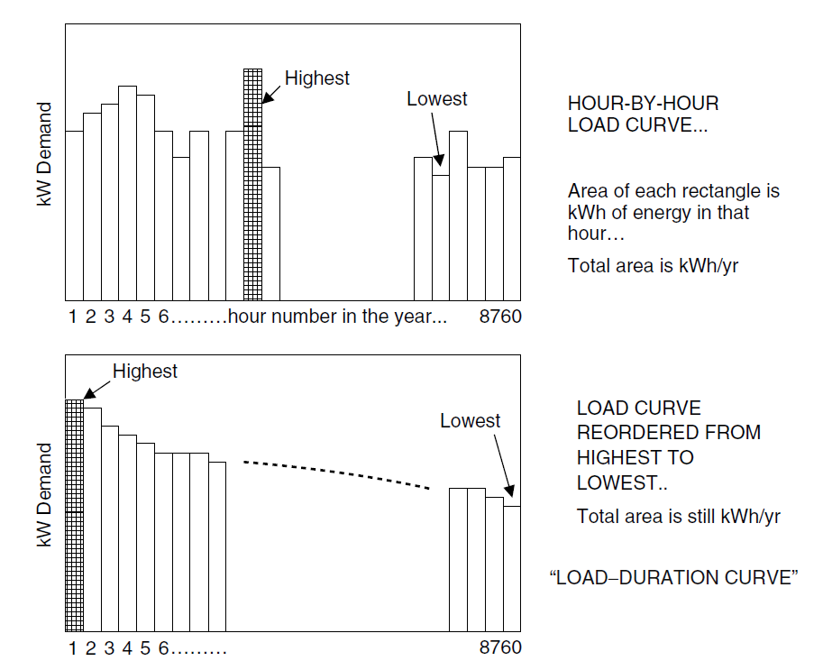
Figure 2. A load–duration curve is simply the hour-by-hour load curve rearranged from chronological order into an order based on magnitude. The area under the curve is the total kWh/yr.
A smooth version of a load-duration curve is shown in Fig. 3. Notice that the x-axis is still measured in hours, but now a different way to interpret the curve presents itself. The graph tells how many hours per year the load is equal to or above a particular value. For example, in Fig. 3.30, the load is above 3000 MW for 7000 hours each year, and it is above 5000 MW for only 1000 hours per year. It is always above 2000 MW and never above 6000 MW.
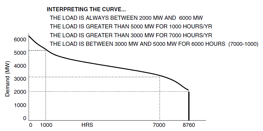
Figure 3. Interpreting a load–duration curve.
By entering the crossover points in the resource screening curves into the load duration curve, it is easy to come up with a first-cut estimate of the optimal mix of power plants. For example, in Fig. 4, the crossover between gas turbines and combined-cycle plants occurs at 1675 hours of operation, while the crossover between combined-cycle and coal-steam plants occurs at 6565 hours. Those are entered into the above load–duration curve and presented in Fig. 4. The screening curve tells us that coal plants are the best option as long as they operate for more than 6565 h/yr, and the load–duration curve indicates that the demand is at least 3500 MW for 6565 h. Therefore, we should have 3500 MW of baseload, coal-steam plants in the mix. Combined-cycle plants need to operate at least 1675 h/yr and less than 6565 h to be most cost-effective. The screening curve tells us that 1200 MW of these intermediate plants would operate within that range. Since combustion turbines are the most cost-effective as long as they don’t operate more than 1675 h/yr, and the load is between 4700 MW and 6000 MW for 1675 h, the mix should contain 1300 MW of peaking gas turbines.
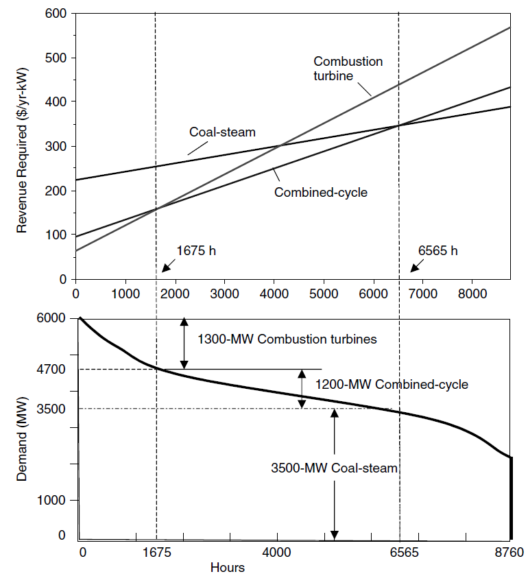
Figure 4. Plotting the crossover points from screening curves onto the load–duration curve to determine an optimum mix of power plants
The generation mix shown on a load-duration curve allows us to find the average capacity factor for each type of generating plant in the mix, which will determine the average cost of electricity for each type. Figure 5 shows rectangular, horizontal slices that correspond to the amount of energy that would be generated by each plant type if it operated continuously. The shaded portion of each slice is the energy actually generated. The ratio of the shaded area to the total rectangle area is the capacity factor for each. The baseload coal plants operate with a CF of about 91%, the intermediate-load combined-cycle plants operate with a CF of about 47%, and the peaking gas turbines have a CF of about 10%. Those capacity factors, combined with cost parameters from Table 1, allow us to determine the cost of electricity from each type of plant.
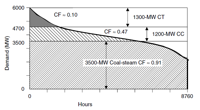
Figure 5. The fraction of each horizontal rectangle that is shaded is the capacity factor for that portion of the generation facilities.
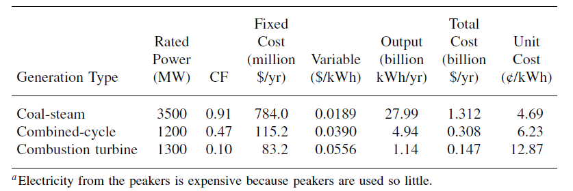
The process and results for our example utility are summarized in Table 1. The baseload plants deliver energy at 4.69¢/kWh, the intermediate plants for 6.23¢/kWh, and the combustion-turbine peakers for 12.87¢/kWh. The peaker plant electricity is so much more expensive in part because they have lower efficiency while burning the more expensive natural gas, but mostly because their capital cost is spread over so few kilowatt-hours of output since they are used so little.
Table 1. Unit Cost of Electricity from the Three Types of Generation for the Example Utility.
start
Using screening curves for generation planning is merely a first cut at determining what a utility should build to keep up with changing loads and aging existing plants. Unless the load–duration curve already accounts for a cushion of excess capacity, called the reserve margin, the generation mix just estimated would have to be augmented to allow for plant outages, sudden peaks in demand, and other complicating factors.
The process of selecting which plants to operate at any given time is called dispatching. Since costs already incurred to build power plants (sunk costs) must be paid no matter what, it makes sense to dispatch plants in order of their operating costs, from lowest to highest. Renewables, with their intermittent operation but very low operating costs, should be dispatched first whenever they are available; so even though their capacity factors may be low, they are part of the baseload. A special case is hydroelectric plants, which must be operated with multiple constraints, including the need for proper flows for downstream ecosystems, water supply, and irrigation while maintaining sufficient reserves to cover dry seasons. Hydro is especially useful as a dispatchable source that may supplement baseload, intermittent, or peak loads, especially when existing facilities are down for maintenance or other reasons.
References:

0 Comments